
Fifth Wave: Progress and Persistence After 100 Years of Suffrage and 4 Waves of Feminism
Task
In the United States, 2020 marks a census year, a contentious presidential election, and the 100th anniversary of (white) women's suffrage. Fifth Wave seeks to identify and analyze key topics, policies, and trends focused on gender equality.
Process
My 2018 Midterm Election Guide inspired this project but focuses on data representing 100 years of progress and persistence in gender equality. Working with one of my students, Sophia Alfieri, we first brainstormed and explored gender inequality and ideas for sources and data sets that could give us some insight. With an extensive list of options to choose from, we narrowed down content to topics that met the following criteria:
Topics that are most broadly applicable to the general population
Data exist that are easily accessible from reliable public sources
Contextual data exist to allow comparisons - over time, across regions, or around the world
Ideally, topics should tie to political policy to allow viewers to feel empowered to vote for their beliefs
Data came from a variety of sources, each formatted a little differently. A concerted effort was made to select datasets that provide a holistic view of each issue as possible - balancing current and historical data, national and international data, and demographic considerations. All data had to be cleaned and formatted in spreadsheets before visualizing in DataWrapper and Flourish. Illustrator was used to stylize some graphics further and to create the color palette and icon system. In some cases, layers of contextual information are presented, like significant events and background information that could account for data behavior.
With nearly 70 data graphics in the project, it was also essential to make sure that there weren't too many forms of visuals. That meant narrowing down the types of charts used for specific purposes (change over time, geographic, comparison between points, and shares of 100) so that the viewer could most efficiently understand the data presented.
Sophia, coming from a public relations background, focused on gathering and writing all copy at each section's beginning. With a massive amount of information to work with, we narrowed down to beginning each topic with key takeaways ("fast facts"), a timeline of notable dates, and historical summaries to understand our current context and how the narrative could progress in the future. Related quotes from inspirational women were selected to lead off each section.
Each color-coded topic then goes into data from the US, followed by data of where the US stands compared to global peers. This project needed to follow a narrative structure. For us, that meant beginning with the historical background then choosing a logical order of topics before ending on how the topics ultimately fall into political policies that we each have control over voting for on Election Day. With the 2020 election also falling in the middle of a global pandemic, it was also essential for us to offer information on different ways to vote as an actionable conclusion.
Finally, a set of Instagram carousels summarize the project, present key findings, and direct users to the full report.

The report is organized into eight sections, each beginning with historical context and represented by its own unique color scheme. This is the general visual system.

Each section begins with a quote from an influential woman in history along with a few key takeaways from the data presented.

Each section topic includes a timeline of key events along with commentary of the past, present, and future of the topic.


The data for each section begins with a focus on trends in the United States.

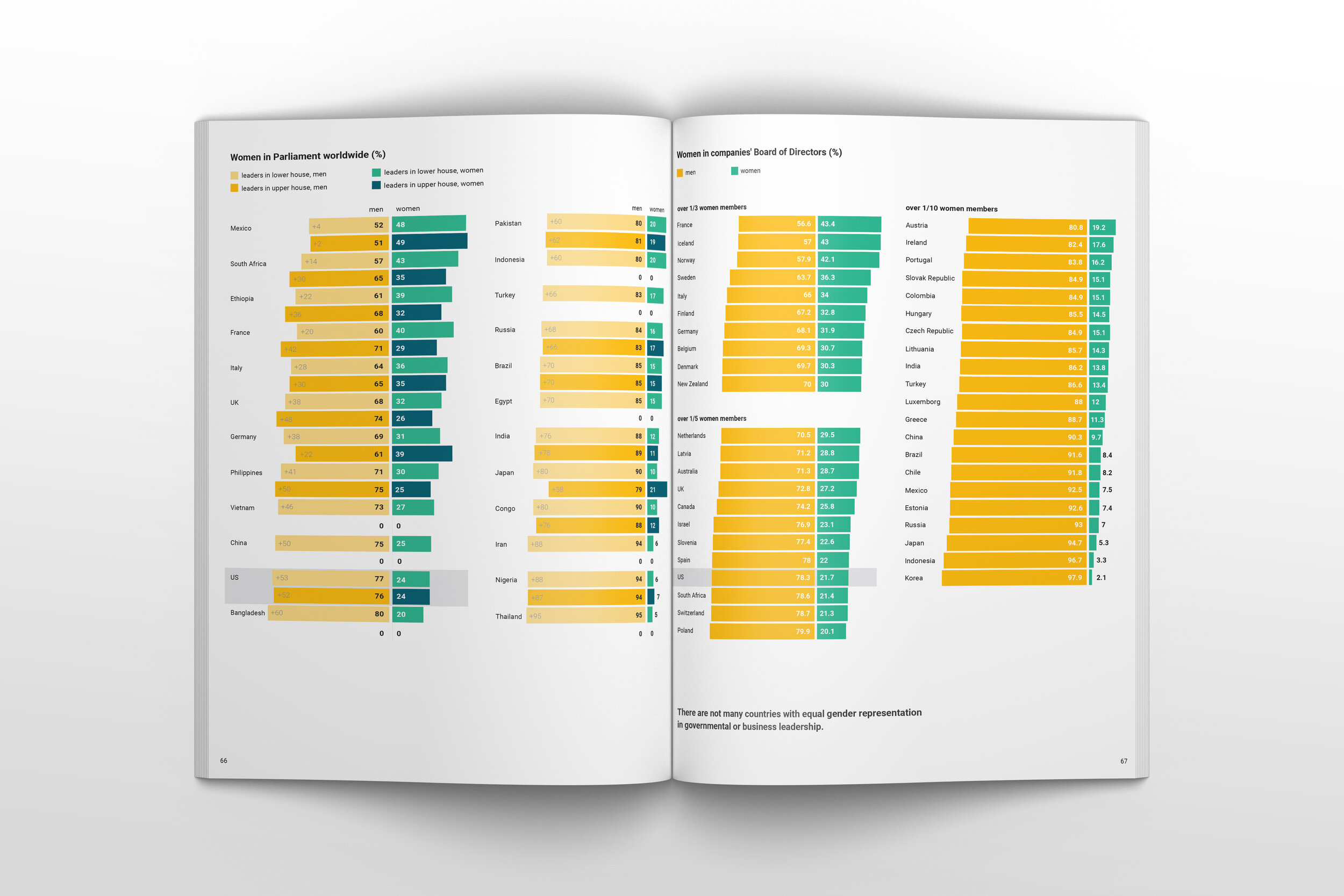
The United States trends are followed by data that contextualize the US on a global stage. While understanding the differences and similarities across the US are important, it is also critical that we understand our position compared to our international peers.


A series of Instagram carousels were created to both summarize the overall report and illuminate key takeaways. All carousels direct users to read the full report.


